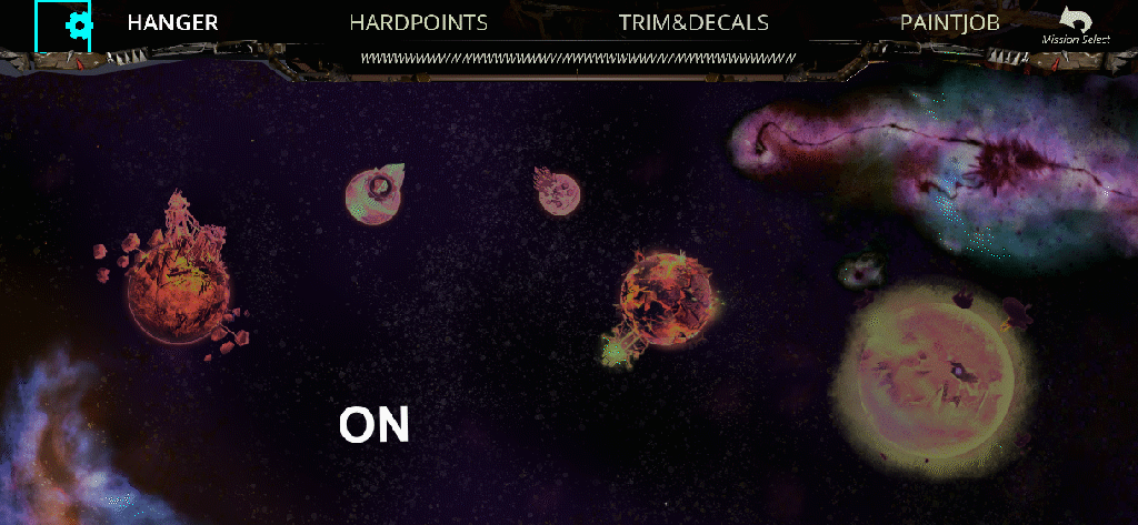
first things first | WTF is everything going to go?

m04 flow doc.png

I came into the game a cpl months into development, some of this had been roughly laid out but nothing had been reviewed for cohesiveness or documented. Time to measure twice and cut once! This is the intended screen-flow for our game, prior to this the only way to confirm the most up to date screen flow was through the art director on slack/verbally. There wasn’t time to curate live docs for this project. This felt hectic and exactly was something a UIUX specialist can help with! Before we mesh out the design system, identifying patterns and use cases are super helpful! You can make assumptions (ofc, we need a pop up notification!) - but it’s harder and often needs tons of reworking unless your first concept implements exactly as intended without any hitches. That never happens in my experience, but working like it will is a timesink. Fail fast and find the most robust course.

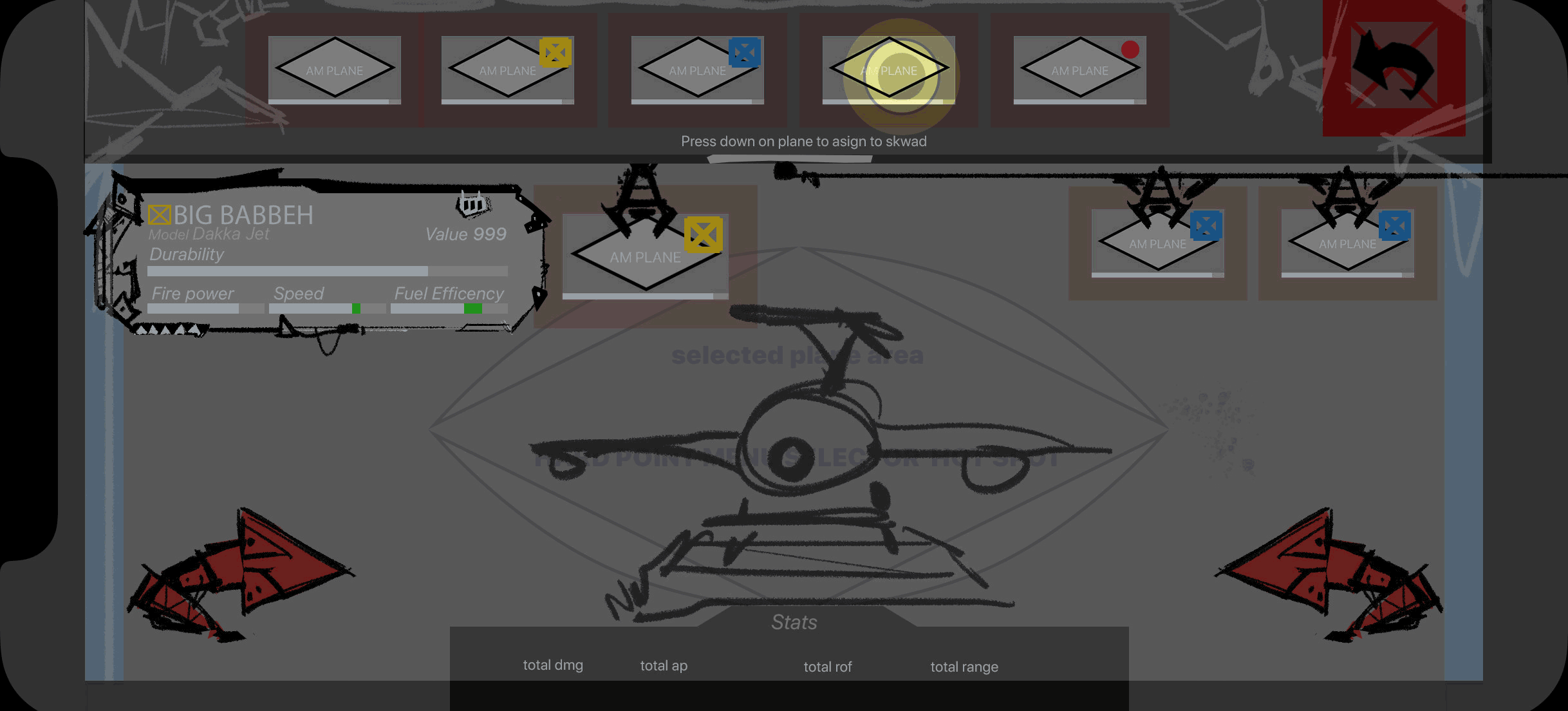
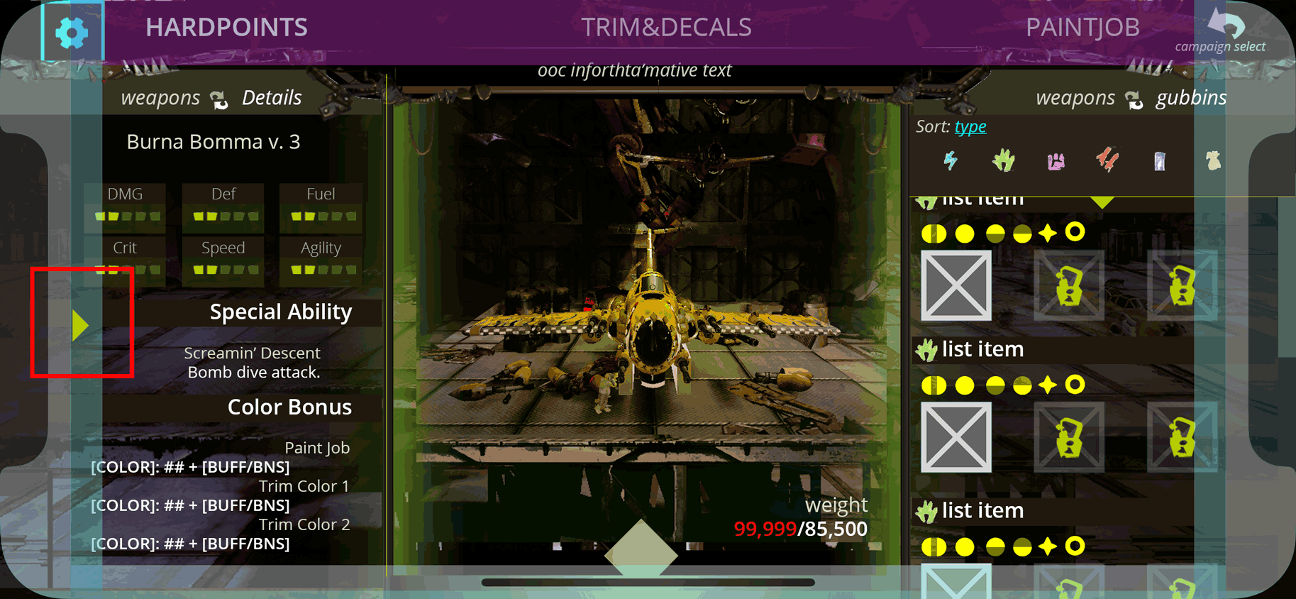
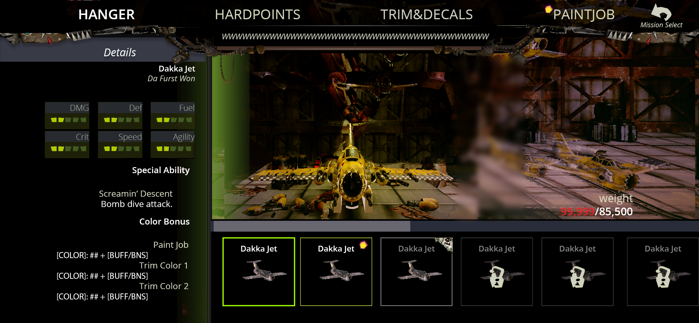
I needed to solidify the core loop of the game for the team, as well as how our detailed inventory system would be managed, grouped and visualized. While developing the content, where and how it would be presented was continually in re-design. I created this flow and eventually user journeys to hash out a "source of truth - live doc” that could be referenced. I wanted to find a way to clarify direction, evaluating needs of a user across all platforms, and figure out just how much time we had for what we wanted. A big hurdle was finding a way to not alienate new players to Warhammer’s rich lore and still cram a ton of that personality and info in. It was also hard to pop the bubble of time-scope when there were so many exciting ideas that people had been developing independently. Some contributors spent months developing idle animations in the background, but then realize a mobile game might not run well with that level of nuances, even though it never got working in the first place. That was time we couldn’t afford to lose, but we should have prioritized needs over nuance.

design | stages of layout from rough wireframe, working prototype and in-game result

menu navigation

I created these animated flows in order to convey nestled information. The initial scope needed re-evaluating to accomidate screen sizes; we couldn’t put all the secondary info on the main page, it was a bit of information overload but AB takes were a very hard sell. It was a little easier to pitch when the concepts were in motion. I wanted to develop our core-target’s menu flow and navigation. Starting on mobile, with the scope to retro the touch-based navigation into cursor based for both Desktop and appleTV - initially trying to go for a destiny-style controller based navigation to fit time. This approach was tabled in favor of individual controls and flows for all 3 deliverable targets: iOS, desktop and appleTV. Eventually the initial flow was re-considered after that direction was hard to evaluate, test and revise in a timely manner - the touch/cursor based presentation as a cross-platform solution.


design | iterations due to unforeseen challenges

stages of main menu / progression menu

The initial direction for this screen requested planets that would revolve in the background, but remain interactive to the player. Upon reviewing the implementation / technical challenges with engineering we approached the director with alternatives. I collected info from competitive analysis for games that also used planetary progressions. After relaying the complexity, similar titles takes, and timeline I was approved to create AB presentations that still achieved a similar look and feel to the original request.


challenges | yo girl learned front-end UMD, workflows and basic blueprint to help our little lean team

I have been working through engineering / platform hurdles for 2D game content since 2008, with a necessity to have alternative approaches for deliverables. There’s just too many things that have come up during my career that totally just kick an intended setup off balance, having an arsenal of approaches to discuss and hash out is critical; It might not be pretty, but it’ll work. I call this duct taping, and it is one of my core-strengths! I think it’s such an important part to game dev I bought the domain DucttapedDesigns.com for my portfolio/independent contractor site (it redirects here now! it is a humdinger to relay). All that build up is to say: I’m going to find a way to make it work and look as great as possible!

So when we needed help dealing with product management, ensuring scalability and ensuring content worked as intended - I started to communicate set-ups, usages and design systems via guides and documentation as concisely as possible. Ultimately the problem was we just didn’t have bandwidth to take more than one pass, revisions were de-prioritized or polish would be post release. In my personal time I familiarized with the unreal documentation, their YT channel - I also binged a TON of Mathew Wadstein’s WTF is series to soak up fundamentals of the software and best practices (Wadstein now works at epic and has official learning videos there 10/10 I highly recommend). Having spent a bit of time in HTML5/CSS realm, I’m aware that the first search result is not a 1-size-fits-all resolution; the only way to is to learn what everything does and when/why you use it. I learned about widgets in UMG and all that entailed within UI front end development, stopping short at blueprint. At a certain point it’s visual programming and absolutely an engineers specialization I would gum up. Instead, I familiarized enough to bounce alternative approaches back and forth. IE: instead of having 2 individual animations to play a menu intro and outro, creating a flipflop that would play the timeline in reverse. Just a supplemental help. I focused on making sure the front end UI looked and functioned as intended. I was revising layouts and doing polish work to the widgets to make them look as intended. I also was ensuring design system usage and consistency, replacing duplicated content with instances, reconnecting the links in blueprint along the way.

I also pushed to adopt parent and class widgets for our reused/branched UI. We didn’t have a ton of time on this project, but individually updating reused elements, having multiple instances of a texture in multiple directories - all in use, often incorrect use cases and naming conventions needing to be “first pass final” was absolutely stressful as an individual, but also made for a ton of time-intense revisions as a team. In order to adopt these workflows I sought approval from the producer and art director after raising concerns with the timeline, then relayed those best practices to the tech artist/game designer. Unfortunately, by the time the practices were picked up our studio lost it’s contract. Dakka was eventually published though!